About the project
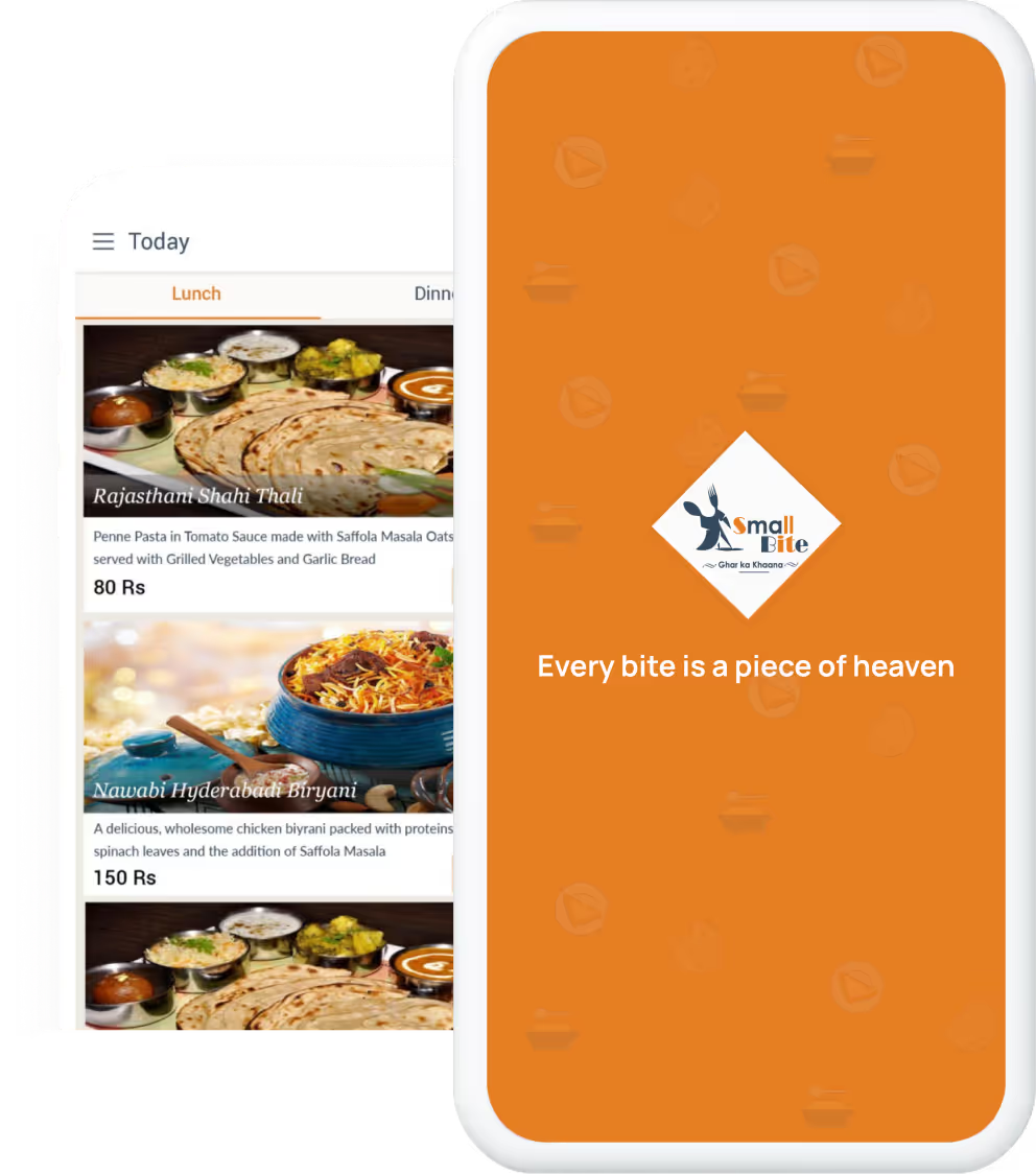
SmallBite was a food delivery startup operating in Pune. It sold quality food at a very reasonable price. In India, there are many food delivery startups like Foodpanda, Tinyowl, Swiggy etc. and all of them have a very similar model. They get food from already existing restaurants, and sell it to the customers. In the entire process, they take delivery charge from the customers, in addition to the commission from restaurants. Small Bite’s model is quite different from them. It displays the list of curated meals upfront on its application so that user doesn’t have to browse through the long menus of restaurants before placing an order. In addition, they have their own kitchens to ensure better quality of the food, and ultimately higher user satisfaction. I was given the task of revamping their entire android application.
Product Design
Research
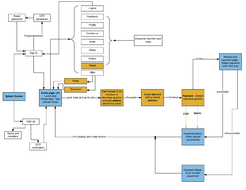
I started with capturing the requirements like idea, vision, and goal, end users. Once I had enough information, I noted down all the use case scenarios that the application was going to have. Then I started making task flow diagrams to make sure that each use case is addressed.
Ideation and Initial Concepts
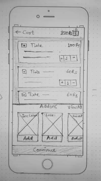
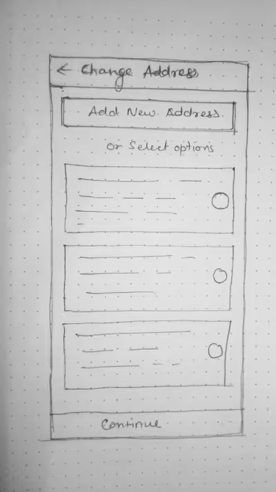
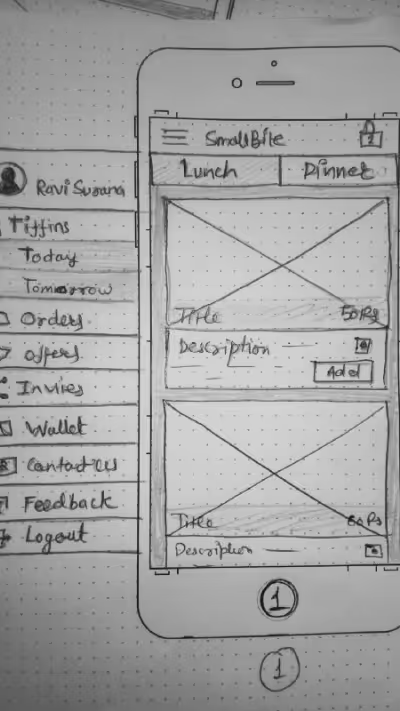
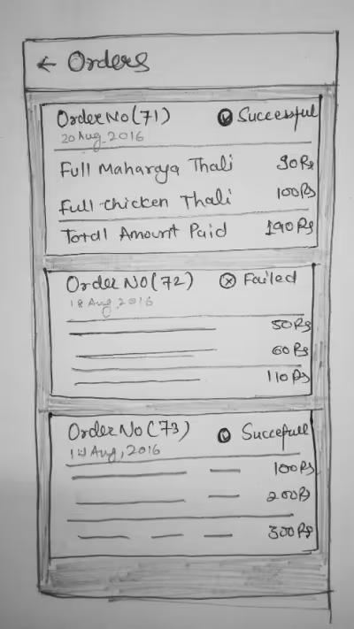
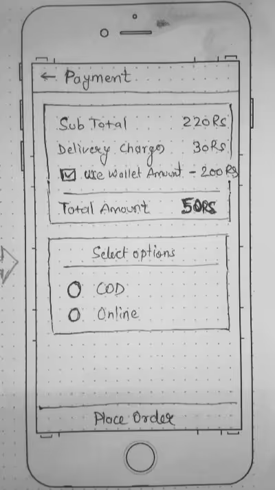
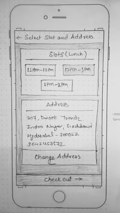
Once the initial research was completed, I jumped into making paper prototypes for initial screens. When paper prototypes were ready I sent them to the client for feedback. I followed this process for all the paper prototypes which helped me make sure wireframes are fulfilling the user and business goals. This process also helped me refine the design at an early stage of the design process. These are some refined prototypes after few iterations :
Design/Prototype
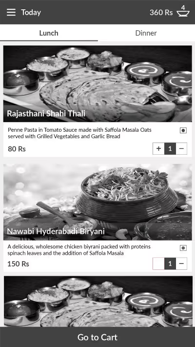
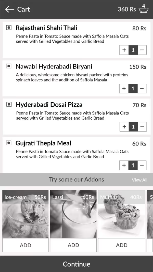
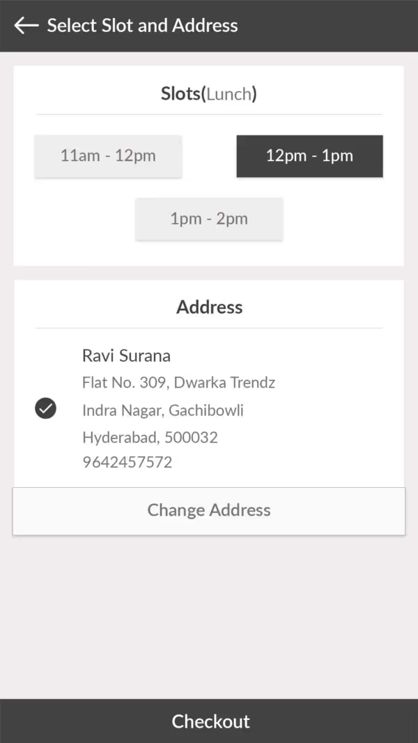
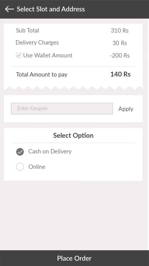
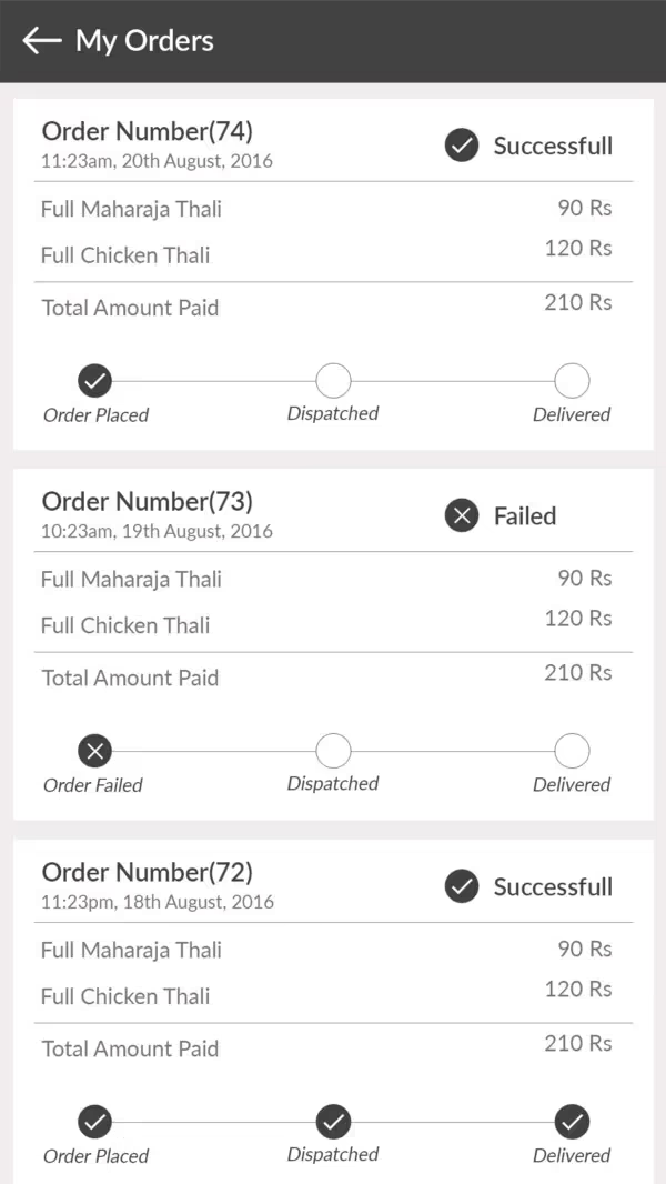
I translated all the paper prototypes into high fidelity wireframes using photoshop. I also created a prototype using an app called Marvels, that allows you to take photos of your interface sketches and link them together to create an interactive prototype. I tested out the prototype with users to ensure that there were no major usability issues. These are some wireframes on a gray scale:
Brand Identity
Colors/Typography
Final stage was to decide the visual design which included selecting a color palette which creates an identity for the brand and selecting a typeface to effectively communicate with the user and give them unique touch to the application.
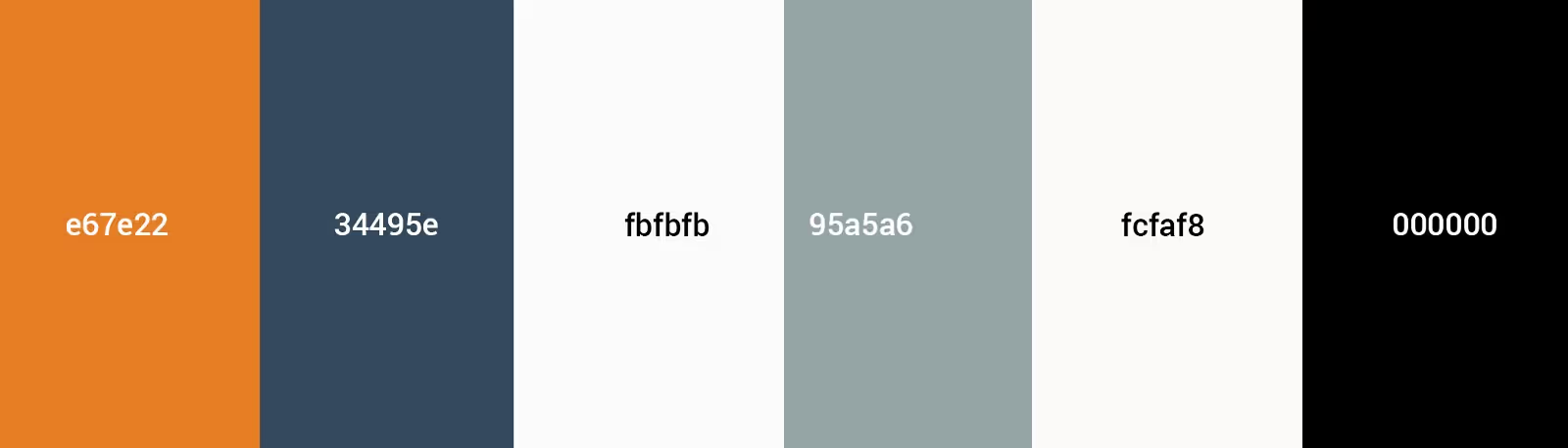
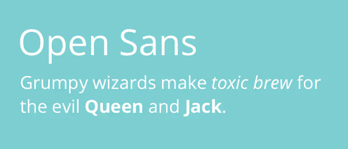
Smallbite already had their logo designed which was using two colors and it is good practice to use the same color palette in both logo and screens to have a sense of association and a link between them. So, I used the logo colors as both primary and secondary color. I used Open Sans in the entire application because of its legibility and friendly appearance.
Once typography and color palette had been decided I converted all the grayscale wireframes to colored one.
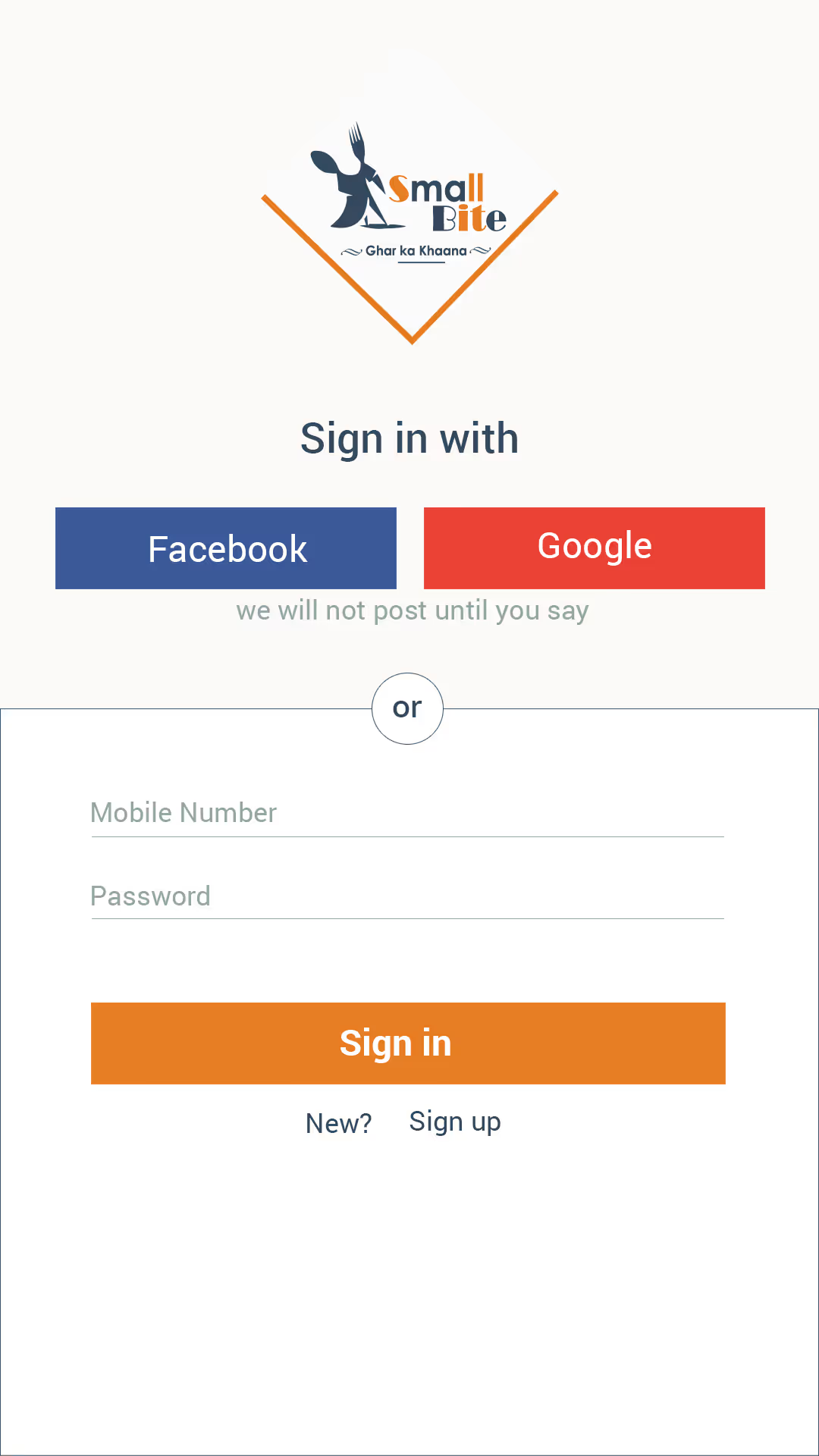
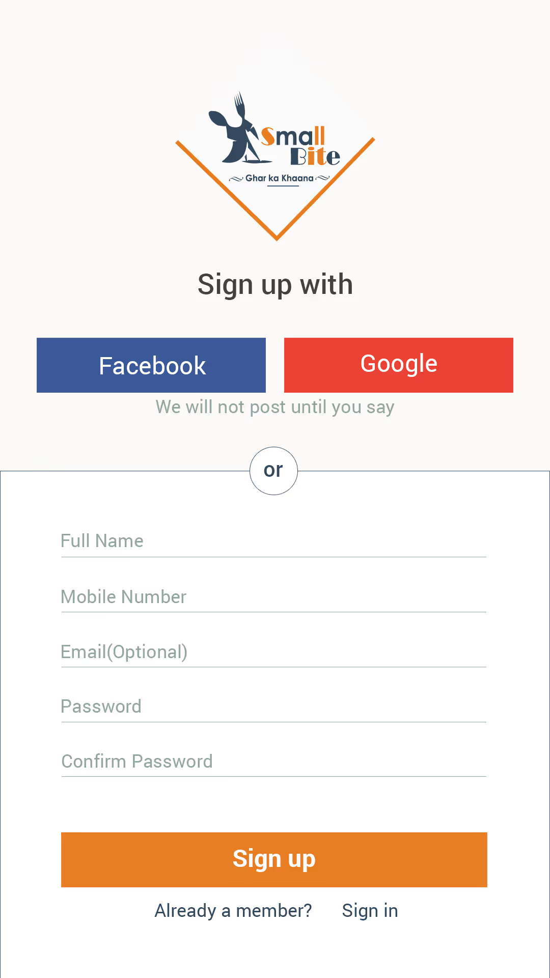
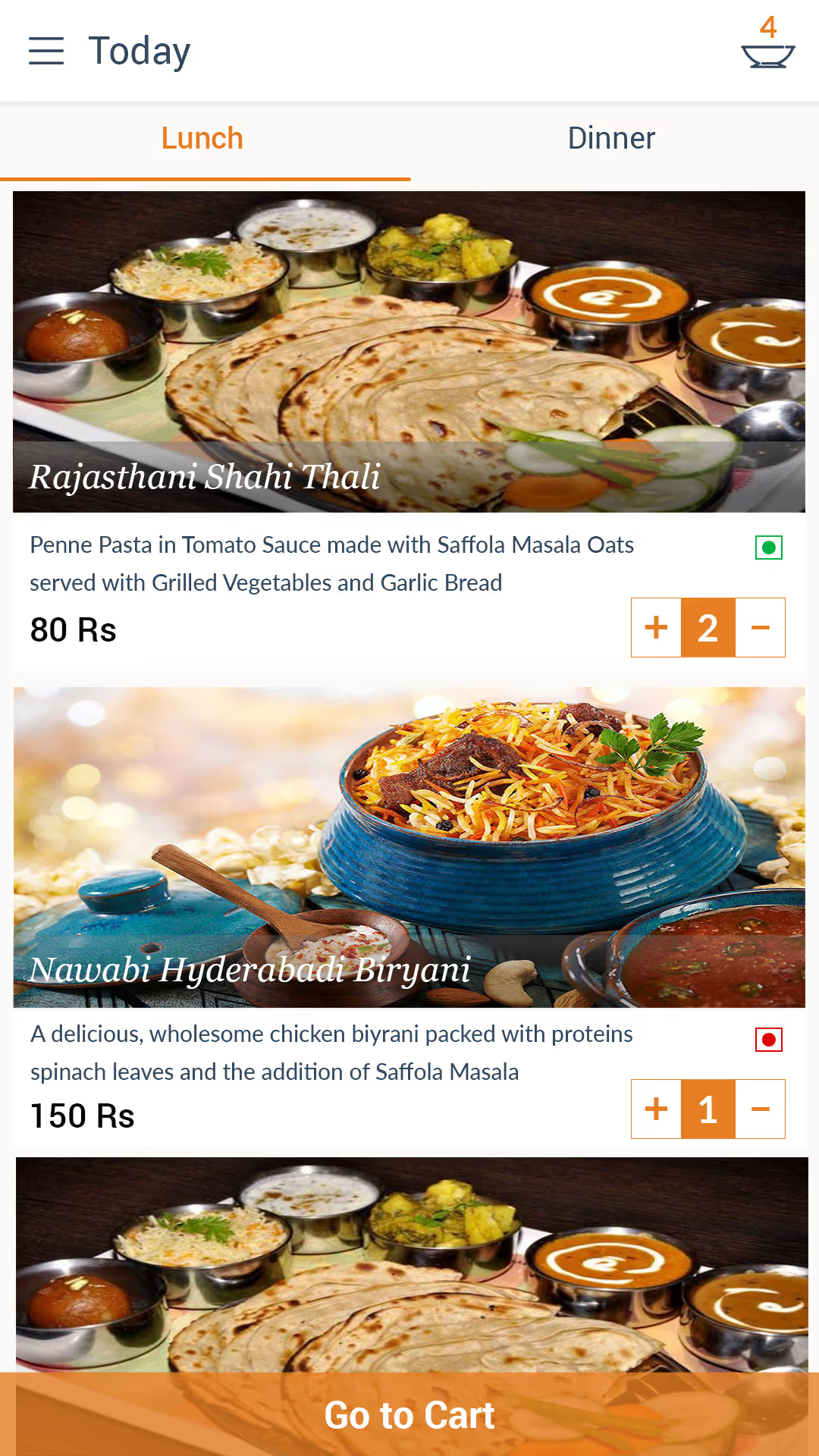
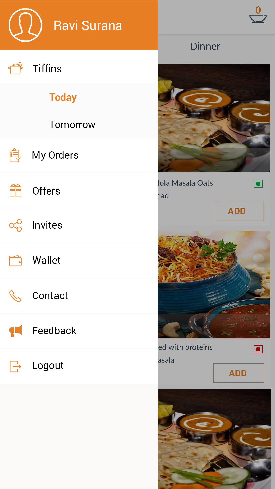
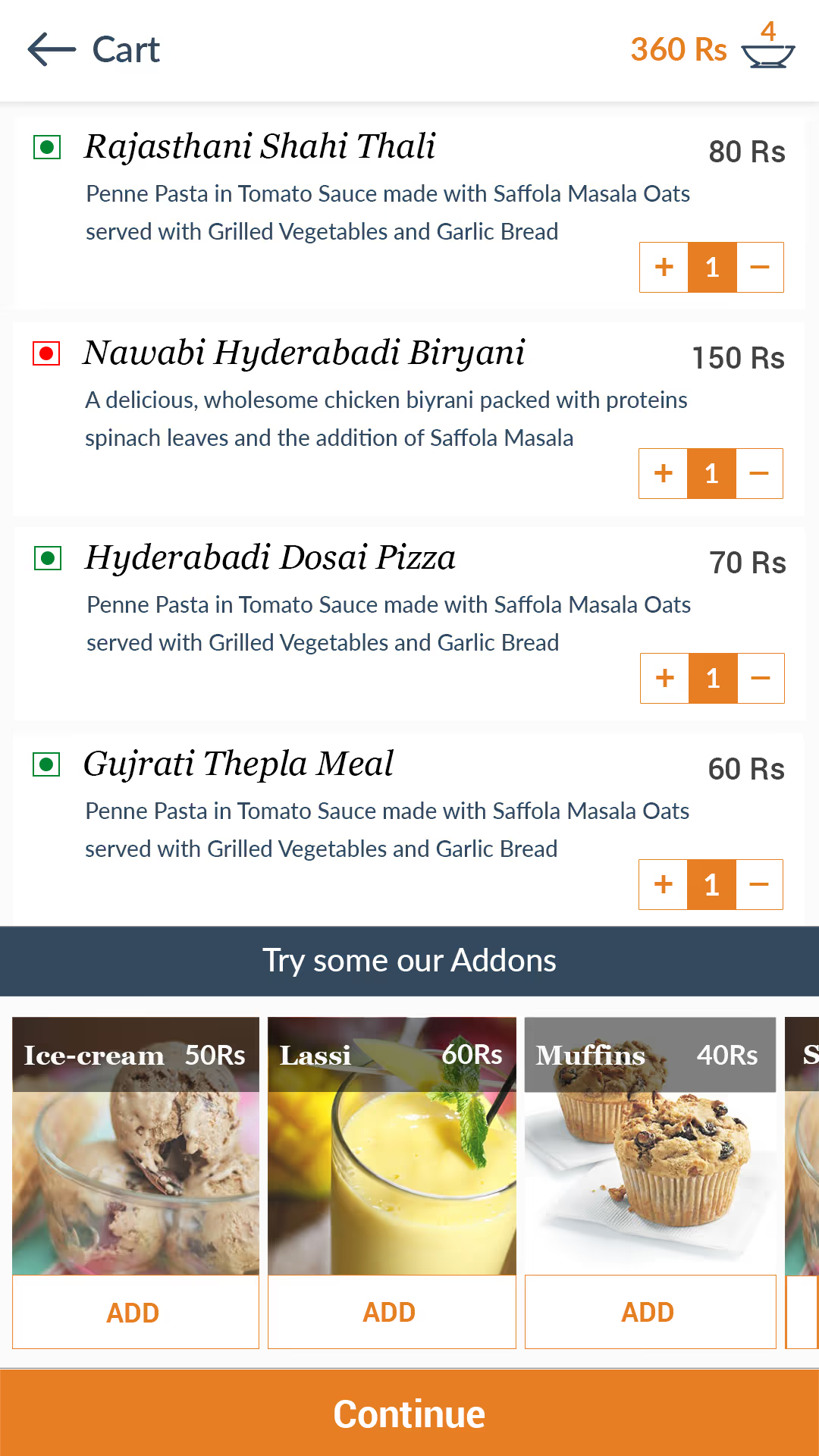
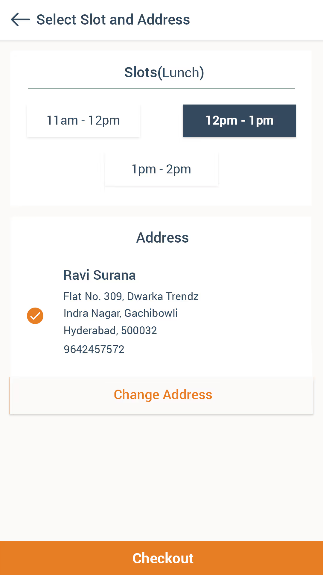
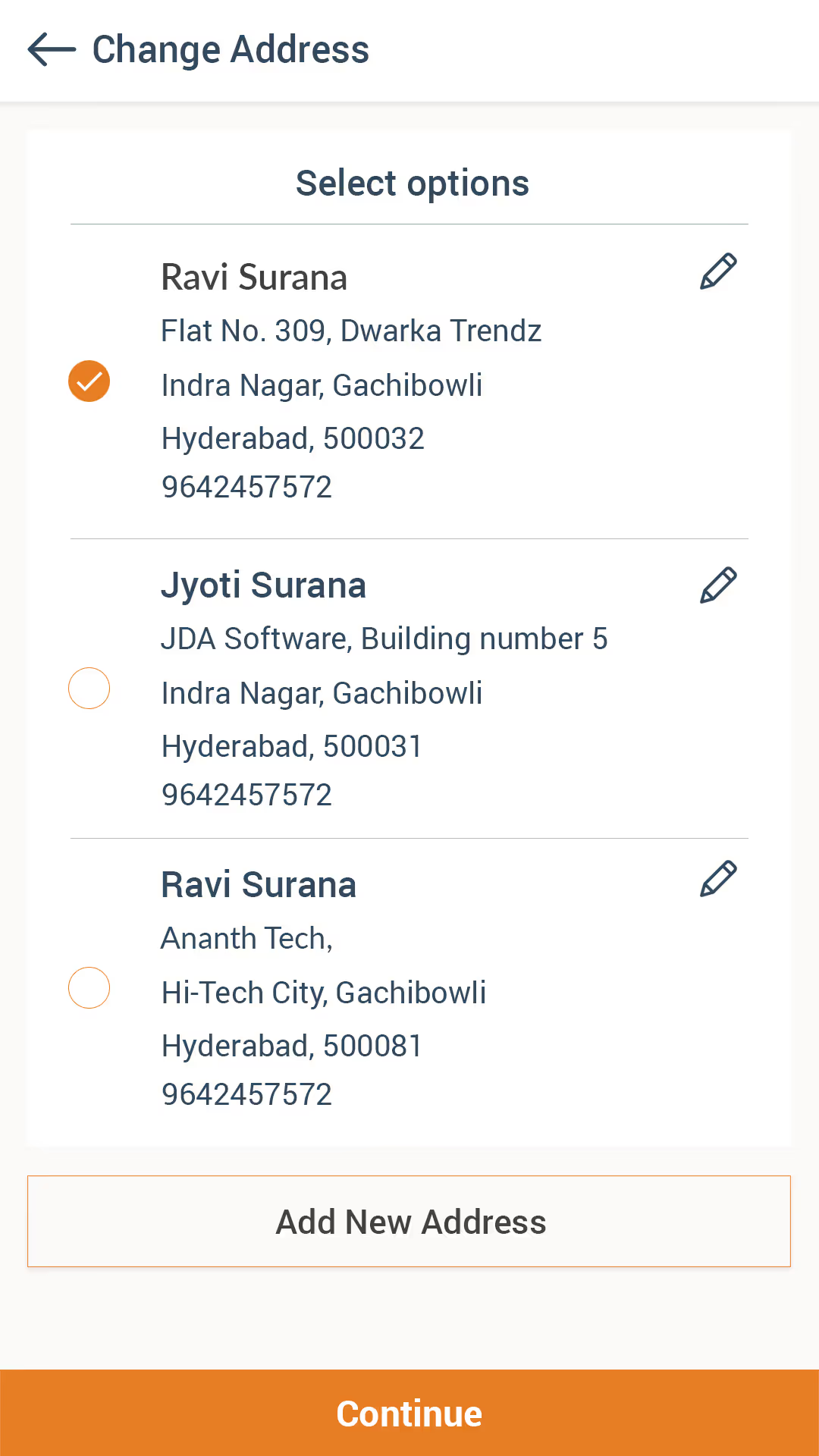
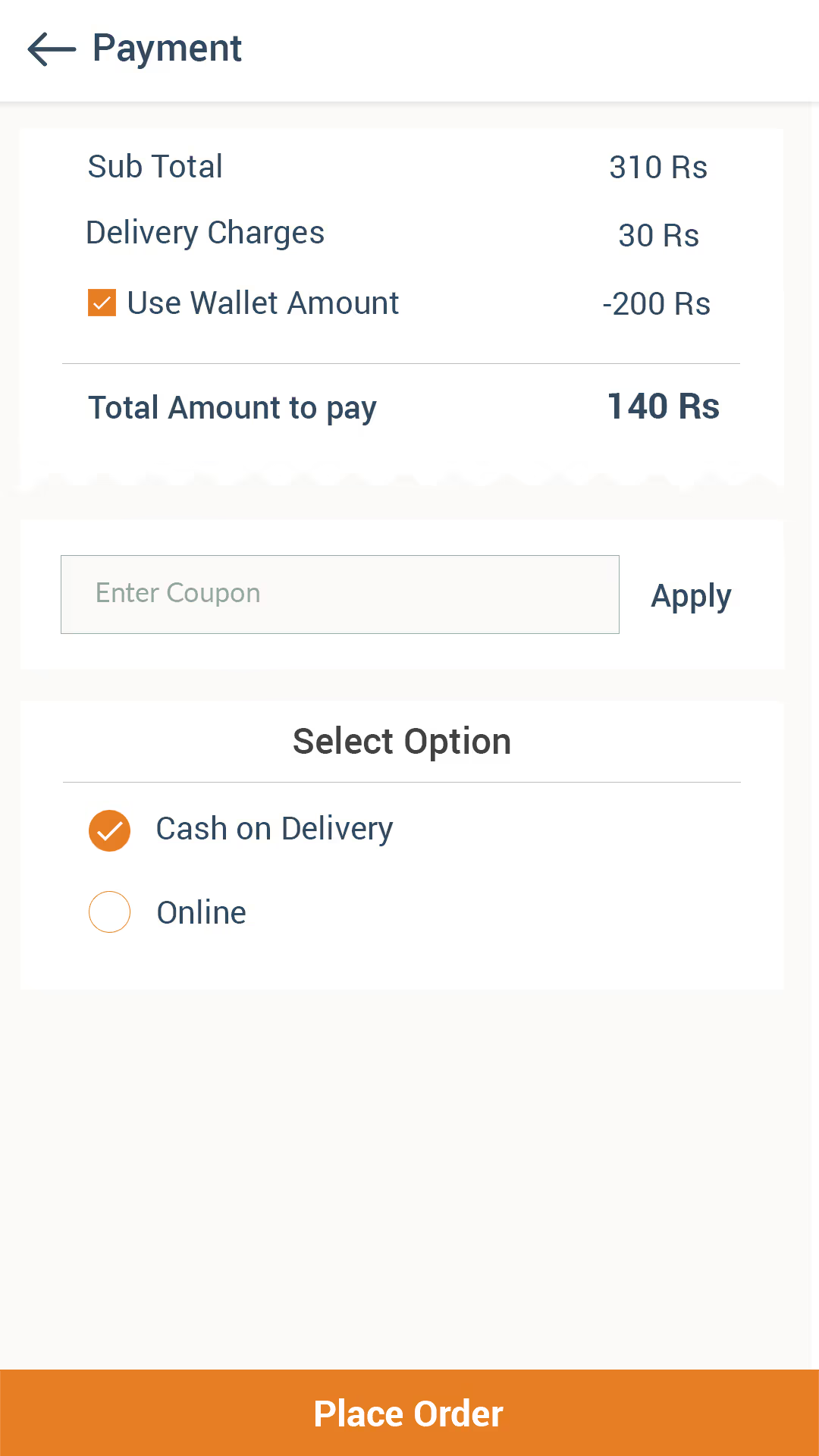
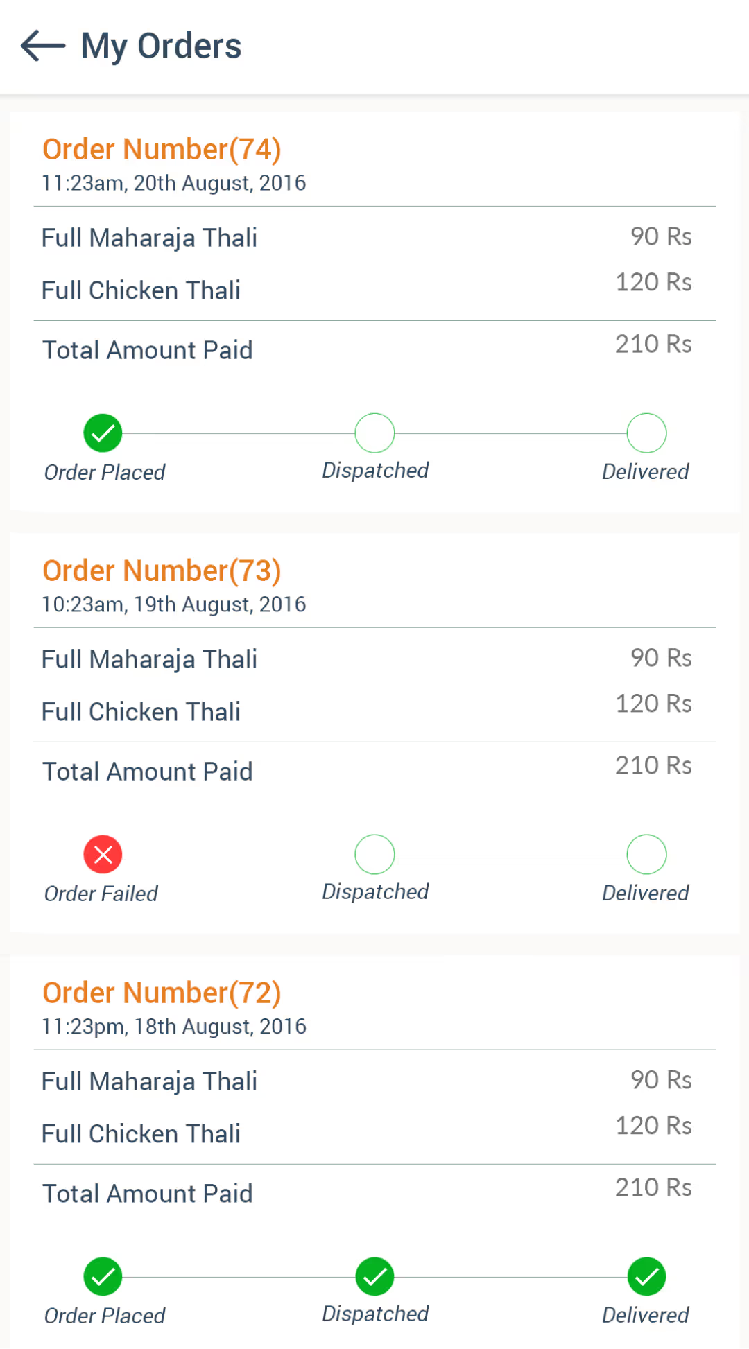
Here are some screens :